 APK FET
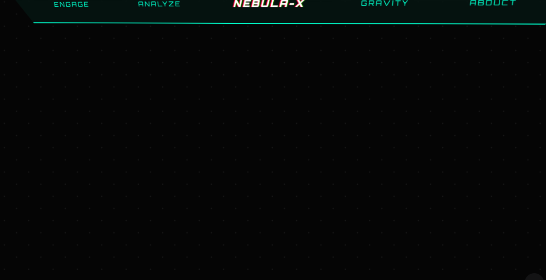
Explore Nebula-X, an interactive "alien tech" navigation bar that defies physics. Featuring 3D tilt mechanics, warp-speed animations, and gravity-shifting navigation, this brutalist sci-fi UI uses Tailwind CSS and JavaScript to create a chaotic, immersive cosmic experience.
Key Features:
Dynamic 3D Perspective: The navbar utilizes a 1000px perspective engine, tilting and rotating in real-time as the user moves their mouse to create a high-tech dashboard feel.
Warp Speed Starfield: An integrated "Engage" command that programmatically accelerates the background starfield animation, simulating a jump to hyperspace.
Gravity-Defying Layouts: The "Gravity Shift" function utilizes CSS clip-path and absolute positioning to physically flip the navigation bar between the top and bottom of the viewport.
Chaotic Interactive Commands:
Analyze: Triggers a sweeping scanner beam across the entire viewport.
Abduct: Simulates a visual system failure by inverting colors and rotating the hue of the entire interface.
Procedural Tech Debris: An automated spawning system that generates floating geometric "artifacts" that drift through the cosmic background.
Bioluminescent Visuals: Designed with a neon cyan and magenta color palette, featuring glitch-text animations and glassmorphism (blur) effects.
Easter Egg Interactions: Includes a sentient cow emoji that reacts to user clicks with unique abduction animations and status log feedback.
<!DOCTYPE html>
<html lang="en">
<head>
    <meta charset="UTF-8">
    <meta name="viewport" content="width=device-width, initial-scale=1.0">
    <title>GALAXY GATEWAY 9000 - NAV-CENTRIC</title>
    <script src="https://cdn.tailwindcss.com"></script>
    <style>
        @import url('https://fonts.googleapis.com/css2?family=Orbitron:wght@400;900&display=swap');

        body {
            font-family: 'Orbitron', sans-serif;
            background-color: #050505;
            color: #00ffcc;
            overflow: hidden;
            perspective: 1000px;
        }

        .stars {
            position: fixed;
            top: 0; left: 0; width: 100%; height: 100%;
            background: radial-gradient(white, rgba(255,255,255,0) 2px) 0 0/50px 50px,
                        radial-gradient(white, rgba(255,255,255,0) 2px) 25px 25px/50px 50px;
            opacity: 0.1;
            animation: moveStars 20s linear infinite;
        }

        @keyframes moveStars {
            from { transform: translateY(0); }
            to { transform: translateY(-500px); }
        }

        /* Navbar Styling */
        .nav-container {
            position: fixed;
            top: 0;
            width: 100%;
            z-index: 100;
            background: rgba(0, 255, 204, 0.05);
            border-bottom: 2px solid #00ffcc;
            backdrop-filter: blur(10px);
            clip-path: polygon(0 0, 100% 0, 95% 100%, 5% 100%);
            transition: transform 0.3s cubic-bezier(0.175, 0.885, 0.32, 1.275);
        }

        .nav-link {
            position: relative;
            padding: 1.5rem 2rem;
            text-transform: uppercase;
            font-size: 0.85rem;
            letter-spacing: 3px;
            transition: all 0.3s;
            cursor: pointer;
        }

        .nav-link:hover {
            color: white;
            text-shadow: 0 0 15px #00ffcc, 0 0 30px #00ffcc;
            transform: scale(1.1) translateY(5px);
        }

        .nav-link::after {
            content: '';
            position: absolute;
            bottom: 10px;
            left: 50%;
            width: 0;
            height: 2px;
            background: #ff00ff; /* Neon Pink contrast */
            transition: all 0.3s;
            transform: translateX(-50%);
        }

        .nav-link:hover::after {
            width: 90%;
            box-shadow: 0 0 15px #ff00ff;
        }

        /* Random Animations */
        .glitch-text {
            text-shadow: 2px 0 red, -2px 0 blue;
            animation: textGlitch 0.2s infinite alternate;
        }

        @keyframes textGlitch {
            0% { transform: skew(1deg); filter: hue-rotate(0deg); }
            100% { transform: skew(-1deg); filter: hue-rotate(90deg); }
        }

        .floating-artifact {
            position: absolute;
            border: 1px solid #00ffcc;
            pointer-events: none;
            opacity: 0.5;
            animation: drift var(--duration) linear infinite;
        }

        @keyframes drift {
            from { transform: translate(var(--startX), var(--startY)) rotate(0deg); }
            to { transform: translate(var(--endX), var(--endY)) rotate(360deg); }
        }

        #status-display {
            position: fixed;
            bottom: 20px;
            left: 50%;
            transform: translateX(-50%);
            text-align: center;
            width: 80%;
            pointer-events: none;
        }

        .scanner-beam {
            position: fixed;
            top: 0;
            left: -100%;
            width: 10%;
            height: 100%;
            background: linear-gradient(to right, transparent, rgba(0, 255, 204, 0.2), transparent);
            z-index: 5;
            pointer-events: none;
        }

        .scan-active {
            animation: sweep 2s ease-in-out forwards;
        }

        @keyframes sweep {
            0% { left: -10%; }
            100% { left: 110%; }
        }

    </style>
</head>
<body class="flex flex-col items-center justify-center min-h-screen">
    <div class="stars"></div>
    <div id="scanner" class="scanner-beam"></div>

    <!-- The Nav-only Focus -->
    <nav id="main-nav" class="nav-container flex justify-center items-center gap-12">
        <div class="nav-link" onclick="triggerChaos('WARP_SPEED')">Engage</div>
        <div class="nav-link" onclick="triggerChaos('SCAN_SECTOR')">Analyze</div>
        <div class="nav-link font-black text-white italic text-xl glitch-text">NEBULA-X</div>
        <div class="nav-link" onclick="triggerChaos('GRAVITY_SHIFT')">Gravity</div>
        <div class="nav-link" onclick="triggerChaos('ABDUCT_VIEWER')">Abduct</div>
    </nav>

    <!-- Visual Feedback Area -->
    <div id="status-display">
        <h2 id="log-text" class="text-2xl font-bold opacity-0 transition-opacity duration-300">SYSTEM STABLE</h2>
        <div class="flex justify-center gap-2 mt-4">
            <div class="w-2 h-2 rounded-full bg-cyan-500 animate-ping"></div>
            <div class="w-2 h-2 rounded-full bg-cyan-500 animate-ping" style="animation-delay: 0.2s"></div>
            <div class="w-2 h-2 rounded-full bg-cyan-500 animate-ping" style="animation-delay: 0.4s"></div>
        </div>
    </div>

    <!-- Persistent Cow -->
    <div id="cow" class="fixed bottom-10 right-10 text-6xl cursor-pointer hover:scale-110 transition-transform">🐄</div>

    <script>
        const nav = document.getElementById('main-nav');
        const logText = document.getElementById('log-text');
        const scanner = document.getElementById('scanner');
        const cow = document.getElementById('cow');

        // Tilt logic for the entire nav bar
        document.addEventListener('mousemove', (e) => {
            const x = (window.innerWidth / 2 - e.pageX) / 50;
            const y = (window.innerHeight / 2 - e.pageY) / 20;
            nav.style.transform = `rotateX(${y}deg) rotateY(${-x}deg) translateY(${y}px)`;
        });

        function triggerChaos(action) {
            logText.style.opacity = '1';

            switch(action) {
                case 'WARP_SPEED':
                    logText.innerText = "WARP DRIVE INITIATED: BYE BYE PHYSICS";
                    document.querySelector('.stars').style.animationDuration = '1s';
                    setTimeout(() => document.querySelector('.stars').style.animationDuration = '20s', 2000);
                    break;

                case 'SCAN_SECTOR':
                    logText.innerText = "SCANNING FOR INTELLIGENT LIFE... (NONE FOUND)";
                    scanner.classList.remove('scan-active');
                    void scanner.offsetWidth; // Trigger reflow
                    scanner.classList.add('scan-active');
                    break;

                case 'GRAVITY_SHIFT':
                    logText.innerText = "LOCAL GRAVITY INVERTED";
                    nav.style.top = 'auto';
                    nav.style.bottom = '0';
                    nav.style.clipPath = 'polygon(5% 0, 95% 0, 100% 100%, 0 100%)';
                    setTimeout(() => {
                        nav.style.top = '0';
                        nav.style.bottom = 'auto';
                        nav.style.clipPath = 'polygon(0 0, 100% 0, 95% 100%, 5% 100%)';
                    }, 3000);
                    break;

                case 'ABDUCT_VIEWER':
                    logText.innerText = "PREPARING FOR ANAL PROBE...";
                    document.body.style.filter = "invert(1) hue-rotate(180deg)";
                    setTimeout(() => document.body.style.filter = "none", 1500);
                    break;
            }

            setTimeout(() => logText.style.opacity = '0', 3000);
            spawnArtifact();
        }

        function spawnArtifact() {
            const artifact = document.createElement('div');
            const size = Math.random() * 50 + 20;
            artifact.className = 'floating-artifact';
            artifact.style.width = size + 'px';
            artifact.style.height = size + 'px';
            artifact.style.setProperty('--duration', (Math.random() * 3 + 2) + 's');
            artifact.style.setProperty('--startX', Math.random() * window.innerWidth + 'px');
            artifact.style.setProperty('--startY', window.innerHeight + 'px');
            artifact.style.setProperty('--endX', Math.random() * window.innerWidth + 'px');
            artifact.style.setProperty('--endY', '-100px');

            artifact.style.borderRadius = Math.random() > 0.5 ? '50%' : '0%';

            document.body.appendChild(artifact);
            setTimeout(() => artifact.remove(), 5000);
        }

        // Cow Interaction
        cow.onclick = () => {
            logText.style.opacity = '1';
            logText.innerText = "MOOO-VING TO NEXT GALAXY";
            cow.style.transform = `translate(${Math.random() * 200 - 100}px, ${Math.random() * -500}px) scale(0)`;
            setTimeout(() => {
                cow.style.transform = 'translate(0,0) scale(1)';
                logText.style.opacity = '0';
            }, 2000);
        };

        // Randomly spawn tech debris
        setInterval(spawnArtifact, 4000);
    </script>
</body>
</html>